Catalyst Lex
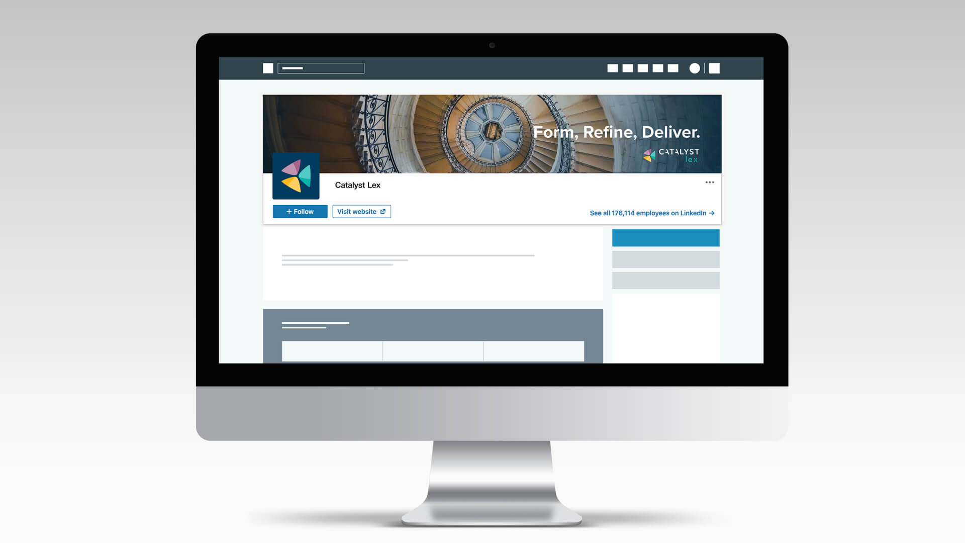
Visualizing the positive transformation: the new brand image of Catalyst Lex.
About the project
Catalyst Lex is an independent consulting firm whose mission is to offer high-quality consulting and strategy implementation to the world’s leading law firms. The mission of Catalyst Lex, as the naming suggests, is to help and accelerate the sustainable and much-needed change in law firms’ organizations: an innovative and delicate purpose that needs to be conveyed in a professional and positive brand identity.
BRAND VISUAL STYLE
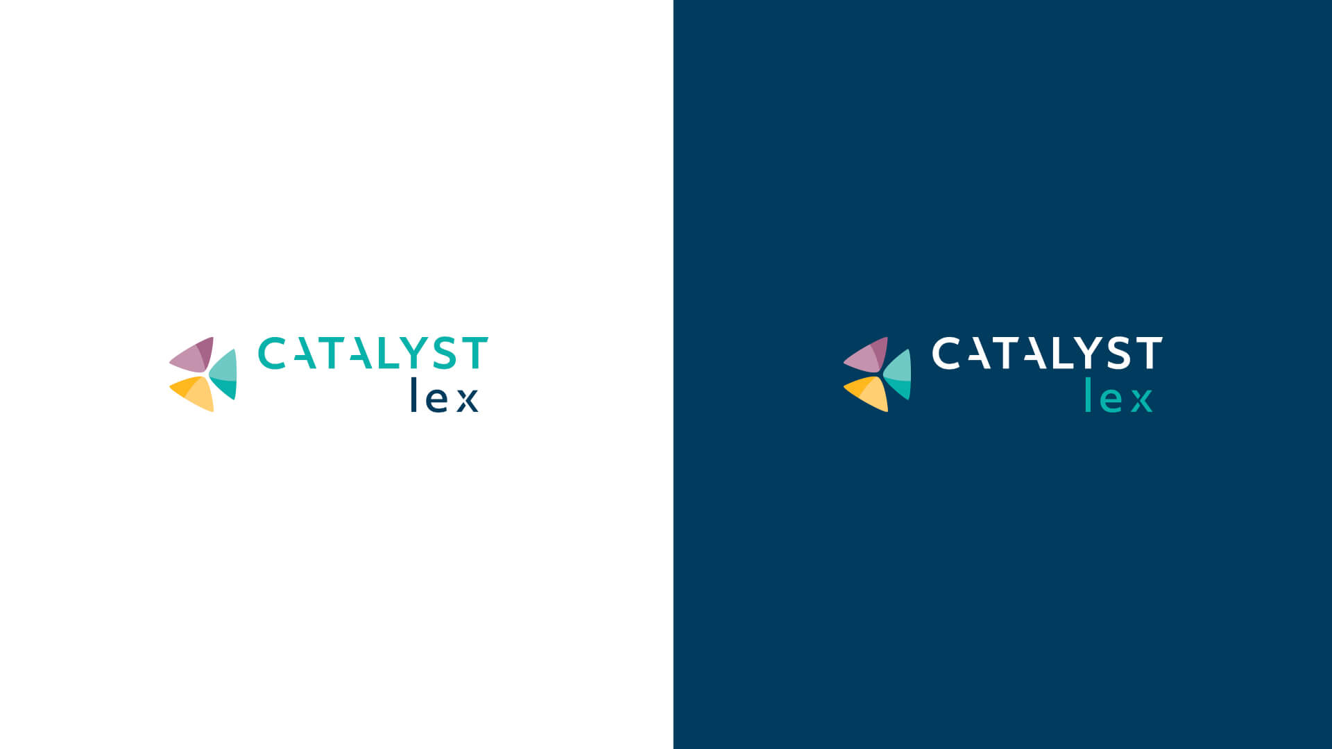
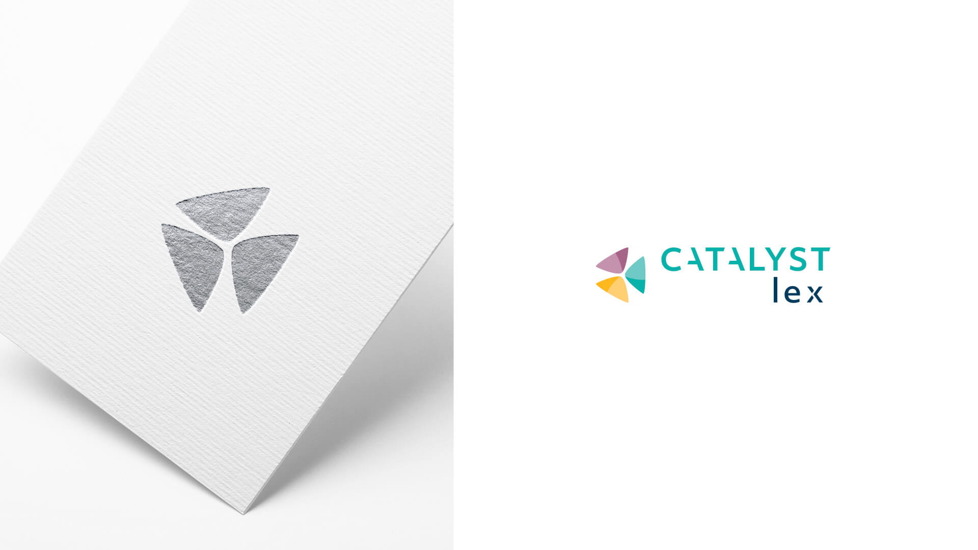
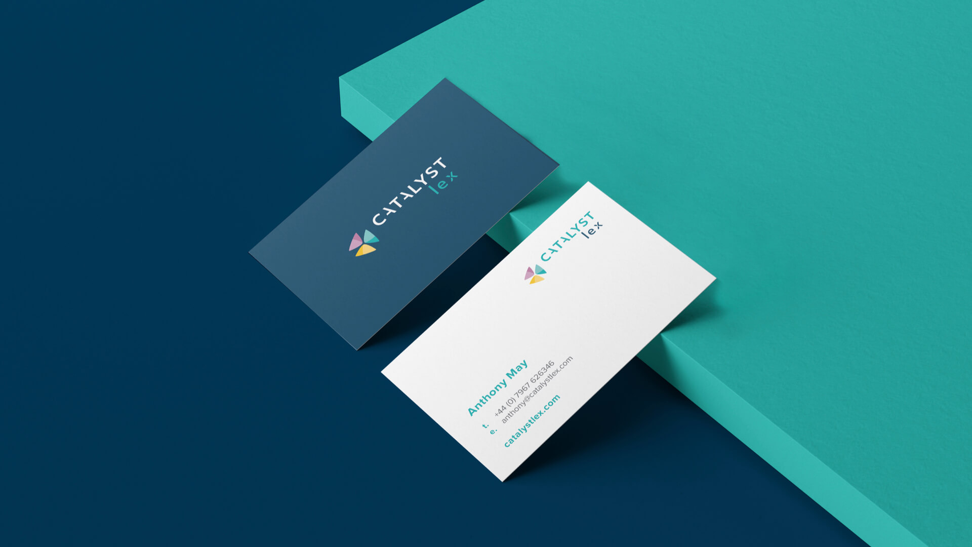
Catalyst Lex offers three main services: Advice, Due Diligence and Coaching. I chose to represent each of these sectors with a specific shade, thus creating a bright and vibrant palette of aqua, mustard, and mauve. Plus, I added to the palette deep blue and two shades of grey, useful to represent the meeting point between the old and the new, the needs of people and their limits, everything that already exists and the novelty. I built up the logo keeping in mind these concepts of synergistic work and encounter, thus designing a symbol that represents the union of the three main business cores of the consulting firm, as well as the different realities that meet and harmonize thanks to the intervention of Catalyst Lex. The three triangles form a pinwheel, coloured with both transparent and solid tints, mixed to create a three-dimensional effect that gives dynamism and depth to the symbol. The choice of the pinwheel is linked to the necessity of conveying feelings of lightness and positivity. The pinwheel represents the attitude towards change: it is not knocked down by the wind, but it is rather transformed into a show of colours and movement.
WEBSITE DESIGN AND ART DIRECTION
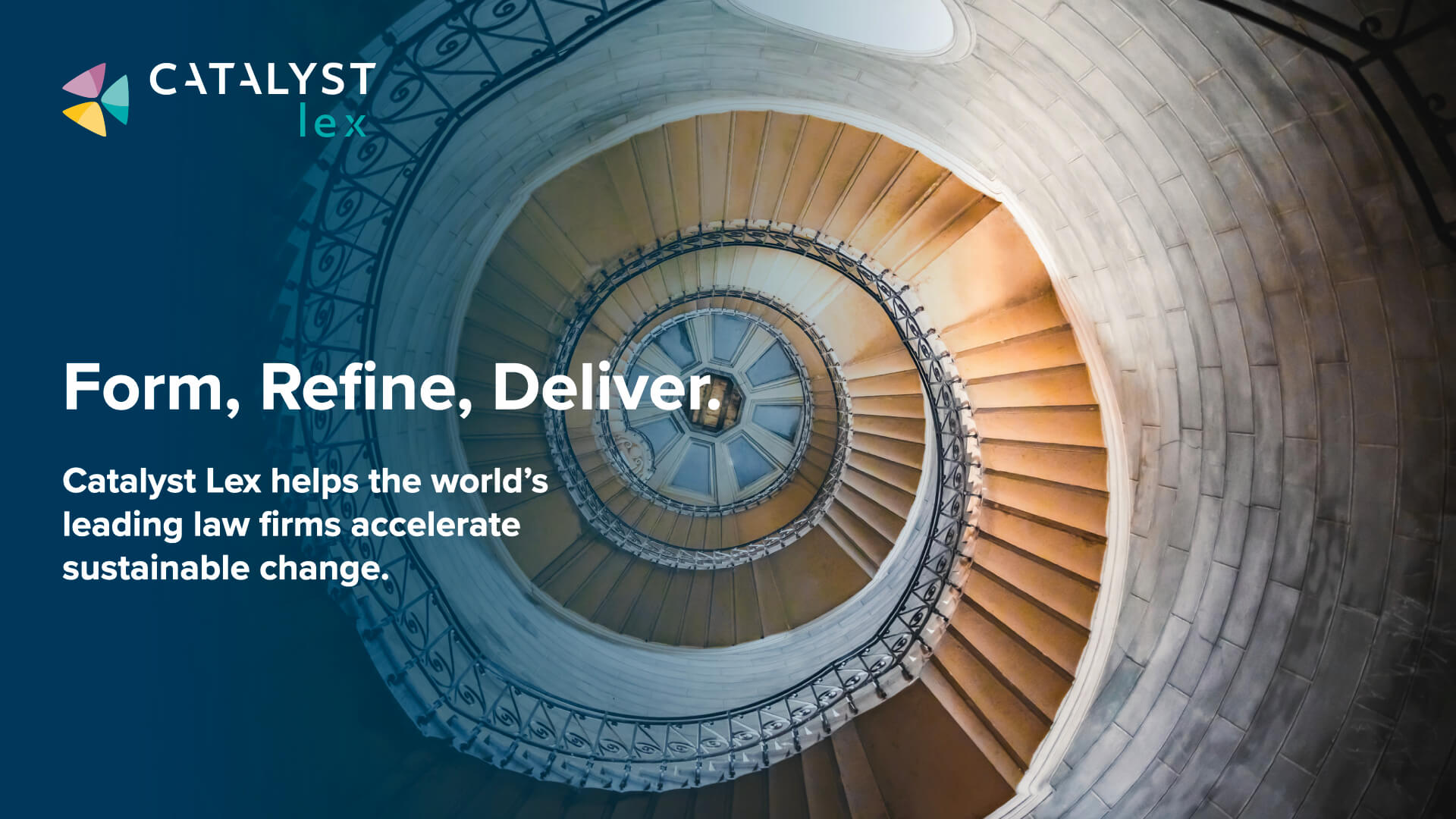
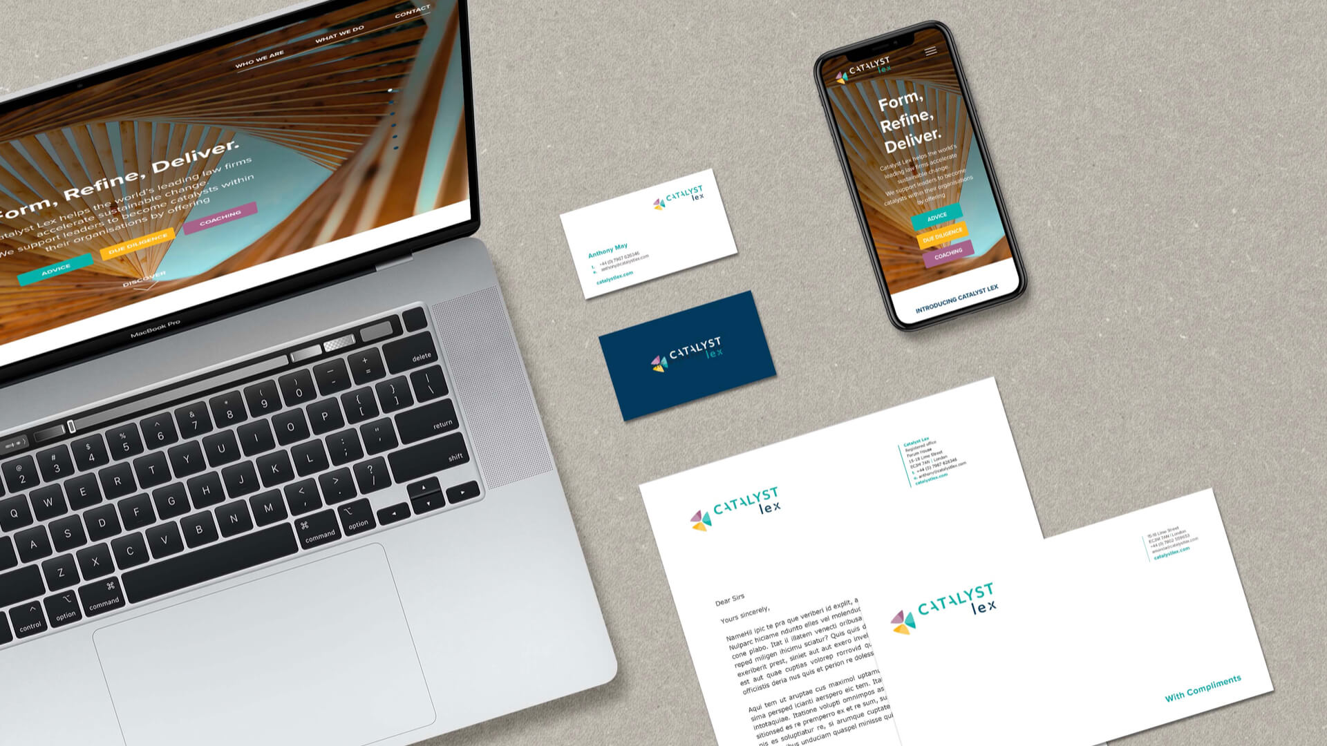
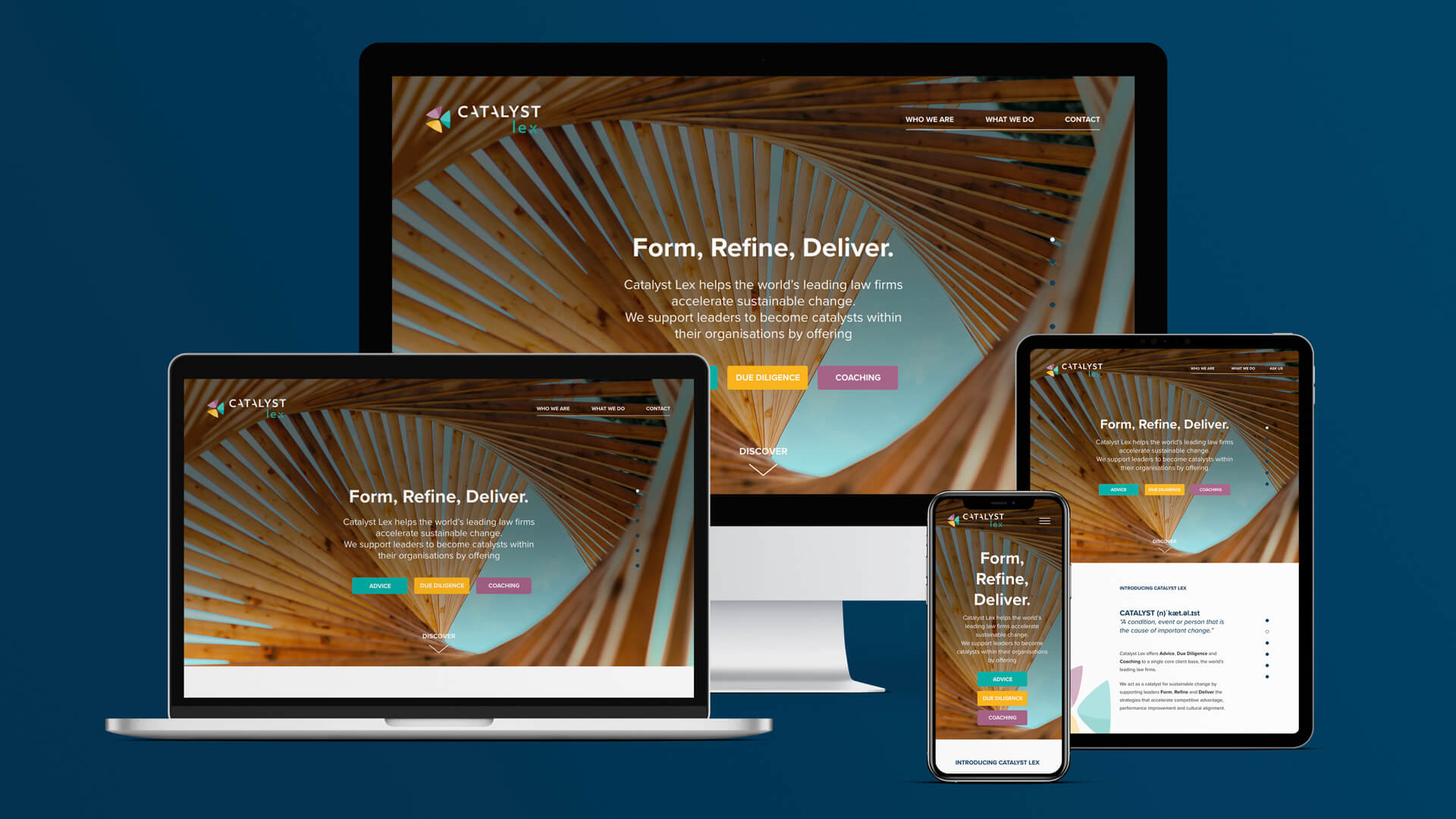
For the official Catalyst Lex website, I designed a simple and intuitive UX. The UI refers directly to branding, presenting clear colours alternating with transparency, always keeping the spotlight on the three shades that belong to the main business units. I chose to visualize Catalyst Lex services with a selection of photos able to communicate transformation and dynamism. All the images have as their main and common elements spirals and circles, which visually refer to the logo and create an illusion of movement. The clear light, the architectural subjects alternating with natural lights and the point of view from below - worm’s eye – have now become the visual storytelling for this innovative service in the panorama of English business consulting.
BUSINESS CARDS AND CORPORATE MATERIALS
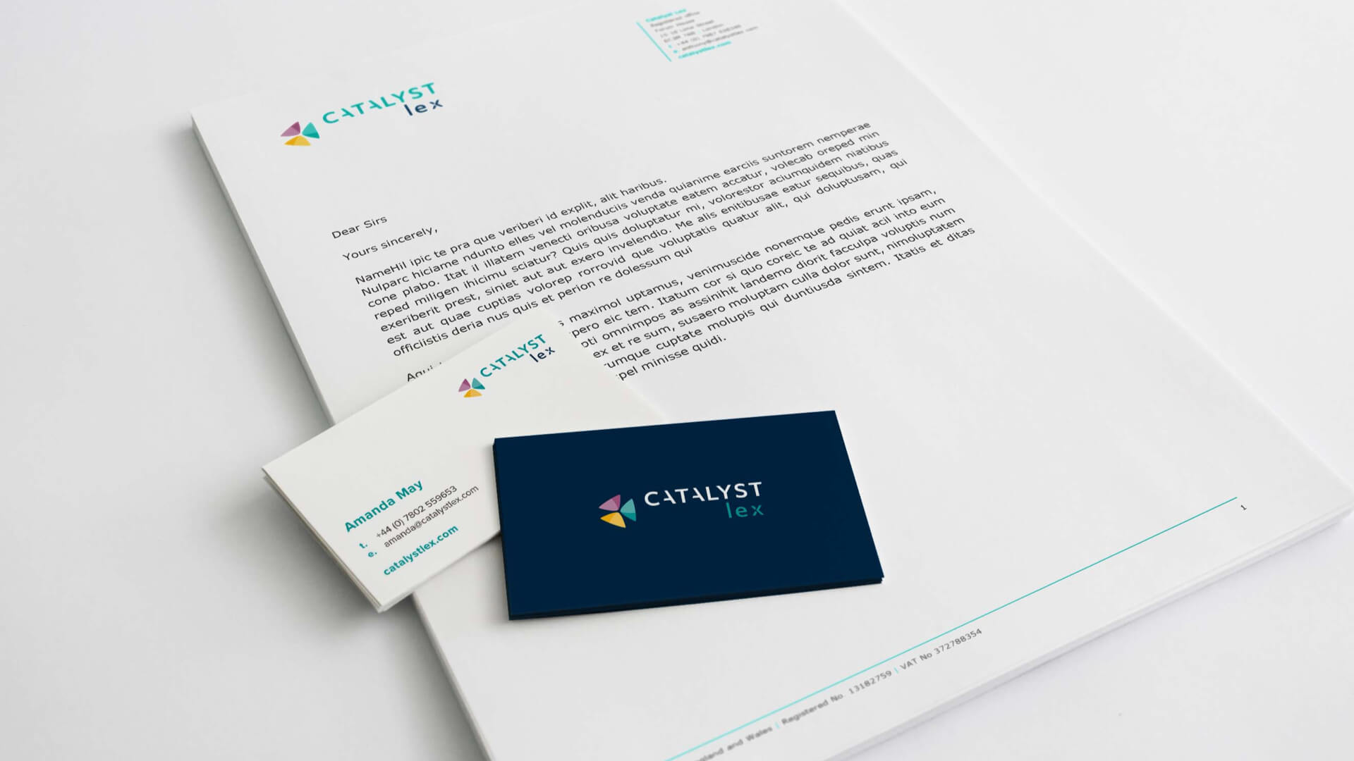
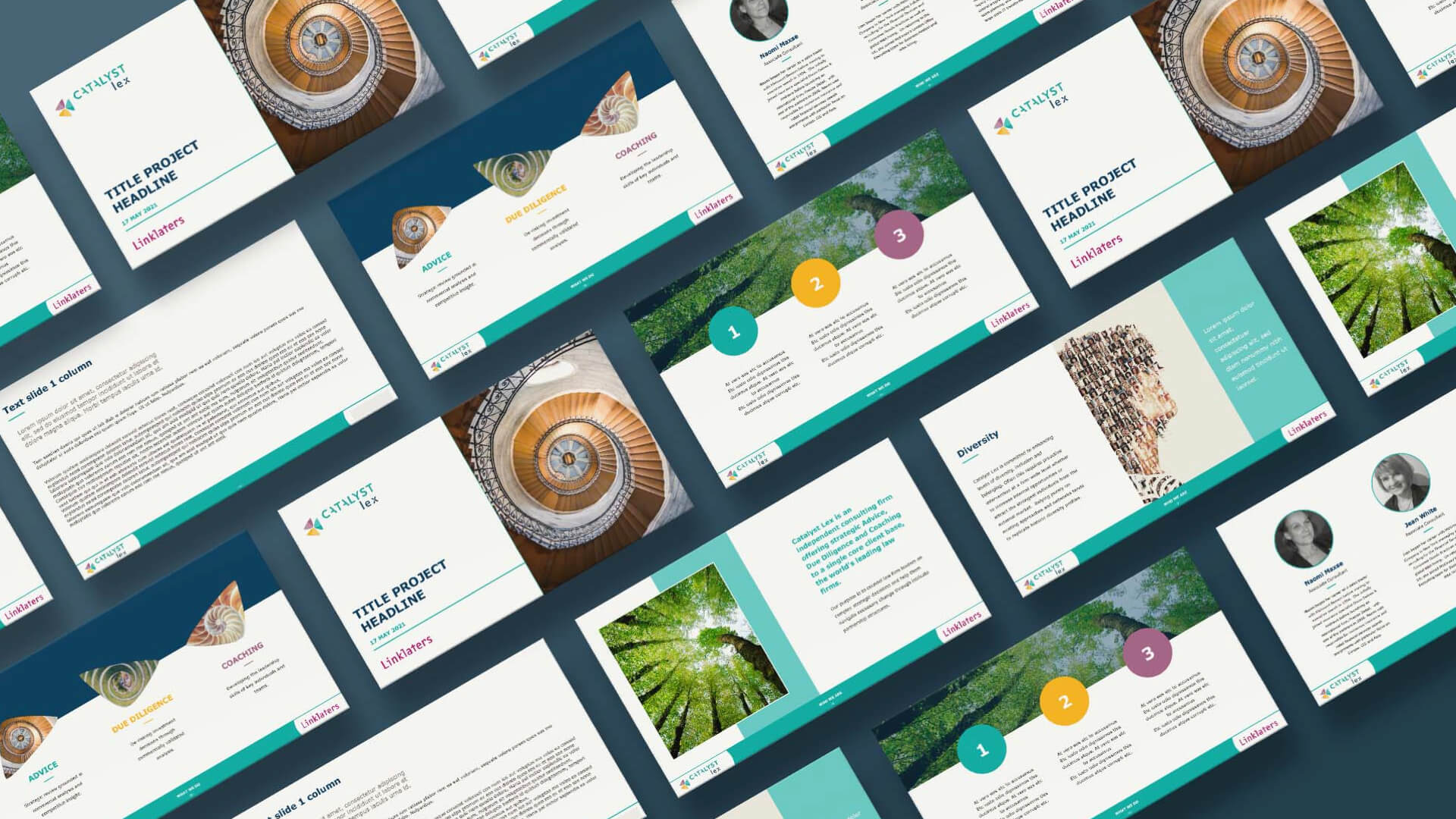
All materials have been designed to keep a clean and formal look, enlivened by the three main brand shades. The fonts chosen are from the Sans Serif family; this ensures optimal reading on both paper and web media. The business cards, with a minimal and colourful design, have been enriched by a UV spot on the logo area during the printing process. The unexpected tactile feeling as well as the glossy look of the logo makes it stand out even more on the deep blue background.
RESULTS
Catalyst Lex has now a coherent and original online-offline integrated image, which combines its two souls: the traditional one, linked to the formal environment and necessary to present itself with professionalism to new customers, and the original and innovative one, which speaks of change, positivity, and lightness. Catalyst Lex is ready to become the market leader in legal advice, and hopefully, it will be so.
TEAM
Creative Director Gaia Fontana
Web Developer Phil Smith
AREA OF WORKS
Logo Design
Corporate Stationery Design
Visual Identity
Photography
Infographic and Iconographic Design
PPT Concept Design
Social Media Design
UX/UI Design
Brand Guidelines
Creative Consultancy & Project Management
GAIA FONTANA STUDIO
BRAND AND DIGITAL DESIGNER
LONDON